CVDACTION Reporting Dashboards
Firstly two apologies. The first one is for not posting sooner. You get caught up with the work you are doing and then realise it’s been more than a year since your last post. The second one is to any developer reading this post. Having mixed with professional coders, I’m in awe at what they can do, and my imitations pale into comparison. Having said that most coders don’t understand the business logic like us medics!
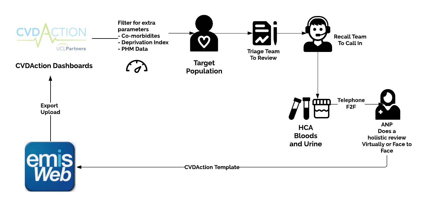
My PCN in Sutton was fortunate enough to be selected as an early adopter of UCLP Partners new venture around Cardiovascular Disease led by Matt Kearney and Laura Boyd. They have been very supportive and helpful in what we are doing in Sutton to help show that by focusing on the right population who have the highest risk, we can make the biggest impact on cardiovascular interventions with a focus on reducing blood pressure, putting patients on a Statin who should be on one and reducing cholesterol.
UCLP has created a set of PowerBI dashboards with high-quality metrics to help us focus on the right patients. They have given us this dashboard to work on all patients in Sutton (213,000) to help improve health outcomes around cholesterol and blood pressure. Our approach in Sutton has been to focus on patients and to risk stratify populations which is more complex as we are merging individual targets but hopefully will give us better outcomes in the long run.
It’s not been without its ups and downs, as our approach is to centralise clinics in our 4 hubs and use the recall team in our PCN to work at scale. It’s that link between managing demand using Digital and capacity using at-scale patient services, which has been so important to get right.
CVDACTION in Sutton
So it got me thinking about in Sutton can we capture this workflow into a way of helping us understand how clinics run so we can quickly pivot to manage and understand flow in as real-time as possible. We use Apex which is excellent and looking at numbers through the system but I wanted to show more interesting data based on business requirements.
I recently came across PowerBI and am so impressed with what it offers. It’s a way of getting data and quickly visualising it in a useful way. In this day and age, we should be moving away from spreadsheets and intelligently interrogating data from different sources to help us achieve our outcomes. So how do we get data from csv/excel files in a format we can integrate intelligently to visualise within PowerBI. The flexibility of PowerBI is that you can just import Excel files, but we are better than that as it also allows you to connect to a database which opens up a much richer way of analysing the data.
How do we get data from CSVs into powerful visual dashboards? As they say, there are many ways to skin a cat and different ways of using PowerBI. This is just one of them.
ETL (Extract, Transform and Load)
I’m sure you’ve come across this term in digital circles. In my simple mind it’s a way of taking raw data, massaging it into the correct format and pushing it into a database which you can attach to PowerBI. The source can be from anywhere but this example we are taking csv files exported from EMIS
Although deceptively simple, scheduling imports gets complex. This is mainly because you need to ensure that you are not duplicating the same data into the database to maintain an up-to-date repository containing a synced data source. When you have a few starting points, it’s manageable, but it ramps up, especially when looking at different data sources. We’ll revisit the ETL later as we discuss this in more detail but the next big piece of the jigsaw and the heart of most applications is the database, as most apps, when looking at relational databases, look to tackle this first.
Database Design
The bane of my life when I did my masters in IT was database design. It was the hardest module and in hindsight the most useful one which I understand and use frequently now. The scope of relational database is out of the scope of this blog but suffice to say you take a business problem and try to reflect how information is stored and its interaction to other sources to the best of your knowledge with the aim to avoid duplication of data and also to help you query the connected data within this source using a scripting language called SQL. This is the database design or ERD (Entity Relationship Diagram) for the CVDACTION Reporting Dashboard
There is still scope for improvement here, and I’ve taken a few shortcuts (eg putting PatientIDs in Targets), and in the end, most databases aren’t 100% normalised, but you go with what works. In the project, we are looking at the following. Areas in bold represent tables that store data. Think of a table like an Excel spreadsheet. Patients who have Conditions which have Targets (CVDACTION Targets) are seen in Appointments where Observations occur (e.g. Blood Pressure). The RecallTeam contacts patients through Interactions for them to be seen in Appointments. Staff attend Appointments
There is normally one to many relationships between tables where one record in a table is associated with multiple records in another for example a Patient has several Conditions. There are different ways to link these tables but in the above example but we’d start off with inserting a reference to the parent table via what we call a Foreign Key. In the above example you can see PatientID in Condition which represents a Foreign Key and allows us to link these tables in our SQL Query.
There is too much to discuss around database design, but I recommend these links to get you started if you are interested but there are plenty if you want to know more
Learn Database Normalization
6 SQL Joins you MUST know! (Animated + Practice)
Complete SQL Mastery (codewithmosh.com) (paid)
ETL Revisited
Ok so now we know where to put the data in the database how do we take the raw csv files to import them in? As stated above the ETL will do this and on the whole maps values in the csv files to tables in the database although this simplifies the problem we face.
I’ve created the ELT App which does this from csvs into a database.
You can see the source code here in my GitHub Page
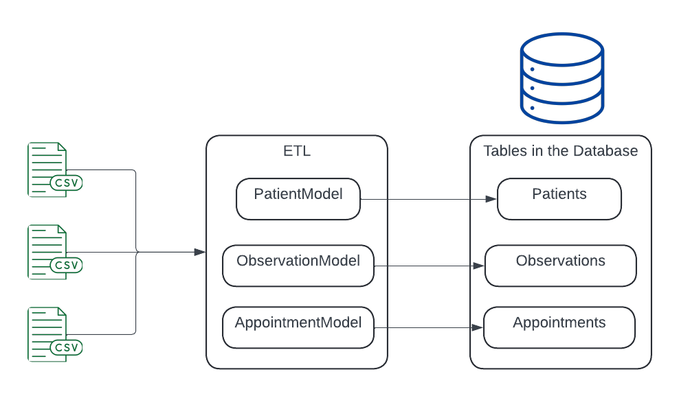
This conceptually is how it works in more details
In a sentence you take the raw data from the CSVs and map them to an in-memory representation of the database called models. It doesn’t need to be exact but only enough to help you manipulate the database to insert, change and delete data accordingly.
This is a path well trodden and there are several Object Relational Mappers and Tools which help us not reinvent the wheel and abstracts a lot of the complexity of database interactions. Entity Framework is used by Microsoft for this purpose. I prefer Dapper as it’s more lightweight. For imports into the Models I tend to use CSVHelper which is so good at automating CSVs into memory
Finally - PowerBI
Now we have the data in the database we can finally access it with PowerBI to create what you need to display the data as you see fit. The key is that the display of the data should be user led where you ask the team what they would like and then extract the data from the database to create slices of information which you can use to show important aspects of the project to help the team make important decisions to improve how the project is running.
The final diagram conceptually is this
In terms of learning PowerBI I really recommend Bas from How to PowerBI who is so good and useful
PowerBI has a language called DAX which allows complex manipulation of data via a scripting language. I’ve just scratched the surface and at the moment create my views via SQLQueries although I’m sure I’ll be able to do the same in code using DAX.
End Point
Enclosed are a few early examples of how we have been using this data in the project.
The beauty of this system is that once automated you can get the dashboard updated in minutes. We hope these dashboard will develop to be very useful in the success of the project
Conclusion
In conclusion, the implementation of PowerBI dashboards in Sutton for cardiovascular disease management we hope will have significant potential in improving health outcomes by focusing on high-risk populations. The process of the reports creating for our PCN involves data extraction, transformation, and loading (ETL) from various sources into a database, followed by creating insightful visualizations in PowerBI. This approach not only enhances data-driven decision-making but also streamlines clinical workflows, ensuring better patient management and resource allocation. The ongoing development and refinement of these dashboards are expected to contribute substantially to the project's success.


